|
牧游社 牧有汉化翻译
Imperator DD #102 - UI rework jiroro, Recruit
Good day! 大家吼!
I'm Jiroro, the UX designer on Imperator: Rome. I've been on the Stockholm team since November 2019. Nice to finally meet you officially! 我是Jiroro,IR的用户体验设计师(译注:也有将UX称为交互设计的,但一般来讲IxD是交互设计,UE/UX是用户体验),我从2019年11月起就在斯德哥尔摩团队工作了。很高兴终于能正式和大家见面了!
So… what is UX? 所以……什么是用户体验?
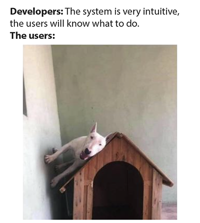 开发者:这个系统非常简洁,用户会晓得怎么搞的。
用户:我不晓得哒!
Sometimes UX and UI get mixed up. The UX - User experience - designers at Paradox are focused on grouping and presenting information, taking the players' perspective into account. We want to make approachable games, design experiences with a flow that feels intuitive and natural (and sometimes we get it wrong, lol, so thank you always for your feedback). Are concepts introduced properly? Is information achievable? What is the players' expectation in this system, this game? Are colors, icons or words used in a consistent way throughout all corners of the game? We analyze, then put things into their designated place in the UI, using the gorgeous bits and pieces that our UI artists created. So sure, I do UI. However, I don’t create the color schemes, ornaments or textures of our UI. I design the experience the player will have in the UI. 有时候UX和UI会混为一谈。在Paradox,UX即指用户体验设计师,他们专注于从玩家的角度来考虑信息的分组和展示。我们希望做一个容易上手的游戏,设计出让人感觉直观和自然的流程体验(有时候我们也会弄错,囧,所以我们总是感谢大家的反馈)。概念的引入是否合适?信息是否可以呈现?玩家在这个系统、这个游戏中的期待是什么?颜色、图标或文字的使用是否在游戏的各个角落都保持一致和连贯?我们分析这些问题,然后把我们的UI美工所创造的华丽东西放到界面中指定位置。所以,当然,我也设计UI。然而,我并不创造我们UI中的配色方案、装饰效果或纹理,我设计的是玩家对UI的体验。
UI Rework 界面重做
It's finally happening, people! The UI rework has been my main focus since I started working on Imperator. Me and my little Stockholm based strike team have been working away from the shadows for a while now. We wanted to take our time to truly figure out our new direction and identify some pain points that needed attention. 各位,这事情终于发生了!自从我开始开发IR以来,UI的重做一直是我们的主要工作重心。我和我在斯德哥尔摩的任务小队已经暗地里干了很长一段时间了。我们想花点时间真正弄清楚我们的新方向,并找出一些需要注意的痛点。
To summarize, my UX mission is: Declutter and reorganize the UI for the whole game, without reducing the amount of information you can access. If we removed parts of the core game, it wouldn’t be Imperator: Rome anymore. Sounds like a fun challenge, huh? 总结起来,我的UX设计任务是:在不减少游戏信息量的前提下,对整个游戏的UI进行清理和重组。如果我们去掉了游戏的部分核心内容,那就不是IR了。这听起来是个有趣的挑战,对吧?
Some high priority points for me: 对我来说一些需要优先处理的要点:
More art! Let art take up more space to enhance the feeling of immersion. Without letting gameplay or functionality suffer.
更多美工!让美工占据更多空间以加强沉浸感。但不让游戏体验和功能受损。
Visual consistency. Introduce a visual language that makes a distinction between what's clickable and what's not, for example.
视觉上的一致性。例如,引入一种视觉效果使得可以点击的东西和不能点击的东西有区分度。
Tabs and headers to group information.
用标签页和顶部栏来组合信息。
And now that 2.0 is announced, I can finally get into some details with you all! 现在既然2.0版本号已经宣布了,我就终于能和大家介绍一点细节了!
Small disclaimer is of course that this is under development as we speak, and the final result may look slightly different from the screenshots. 需要事先说明的是,我们在讲的这些内容当然还处于开发阶段,因此最终成品可能会和下面的截图有细微的差别。
Let's start with… probably the busiest window of the game: Province & Territory UI. 让我们先从……也许是游戏中最频繁的界面——省份和领土界面开始!
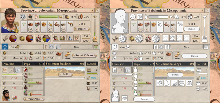
You know this view. 你晓得这个界面的。
What I did first was to analyze what we have here. What does everything mean, what belongs to what? I usually create flat uncolored vector icons - low fidelity - to avoid getting distracted by styling at this stage. 我要做的第一件事就是分析这个界面里有什么东西,每个东西意味着什么,哪些东西属于哪些东西。我通常会先创建一些平面未上色的矢量图标——不是那么精准——以免在这个阶段因为美术风格而分心。
After identifying some problems that I want to solve, it's drag and drop time. Grouping the pieces to add some structure! I ended up with a wireframe like this: 在找出一些我想解决的问题后,就到了拖和拽的时间了。将各个部件进行分组,再增加一些结构!最后我得到了一个这样的线框:
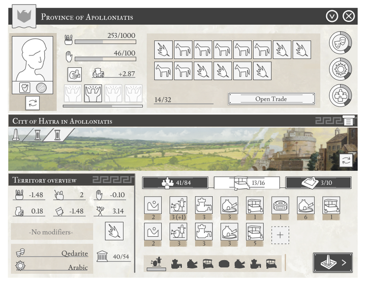
And through some sort of dark, mysterious magic it turns into this latest version, implemented (usually by Arheo or myself) in game: 然后,再通过某种黑暗神秘的魔法,它变成了这个最新的版本,再在游戏中实装(通常是由Arheo或我自己实装进去):
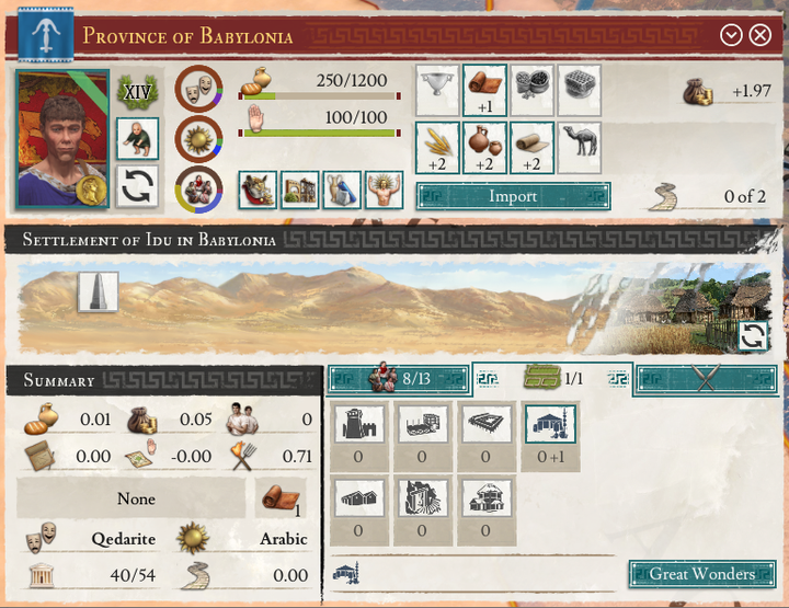
Tadaa! We decided to have a designated color for buttons in the UI rework. Everything clickable is now teal colored in some way, with the exception of flags. In headers, buttons are white since it blends in better than teal. 你猜对了!我们决定在UI重做中为按钮指定单一颜色。现在除了旗帜之外,所有可点击的按钮都以某种方式变成了茶色。但在顶部栏中,按钮还是白色的,因为它比茶色更容易融合进去。
In Province & Territory UI, we still have Province on top, Territory on bottom. The two sections get a clearer separation now with our bold headers. 在省份和领土界面,我们仍然把省份放在顶部,领土放在底部。现在我们在这两个部分中间加入一个粗的顶部栏,使得这两部分区隔得更加明确。
Various things have been cleaned up and aligned, like the progress bars, Province income is now combined into one value (you can still find commerce and tax income separately in the tooltip). Trade goods get more space than before, too. 许多东西都被清理和调整了,比如进度条。省份收入现在合并为一个值(你仍然可以在提示栏中找到商业和税收分开列明的收入)。贸易商品也比以前得到了更多的空间。
The terrain image is used in a bigger format to bring more focus to that. On the right side we have new illustrations to show the territory status (this one’s the settlement image). 地形图片使用了更大的格式,使之更加集中。在右边我们有新的插图来显示领地的状态(这里展示的是定居点的图像)。
And, of course, the tabs. Pops, Buildings, Tactical. 然后,当然是标签页了。分为人口、建筑和策略。
Moving on to the top bar navigation. We scrapped that and moved the buttons to the side: 接着说顶部栏导航。我们取消了这个,把按钮移到了侧边:
 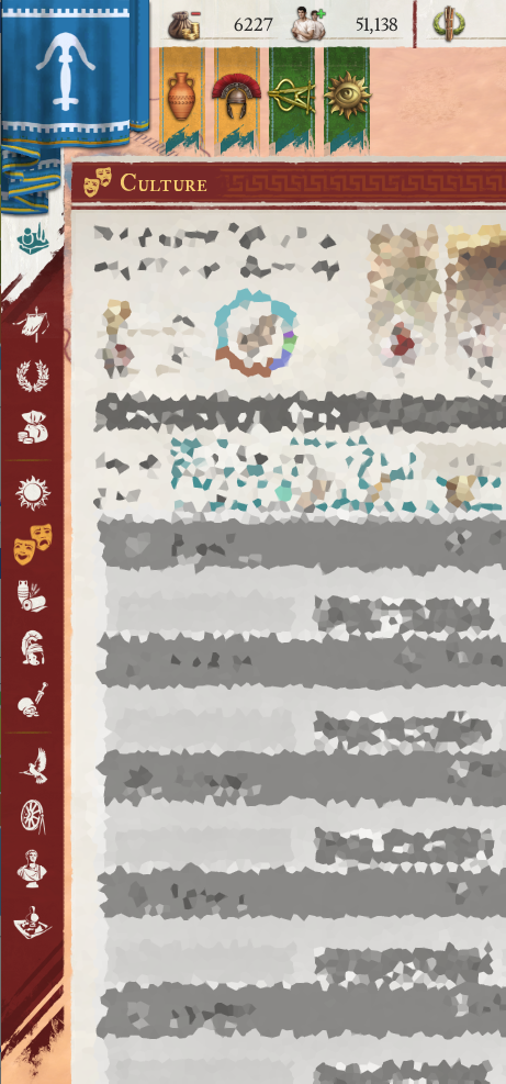
The gods in the old buttons are extremely beautiful, but it was often hard to remember which god represented which UI. We went for a flat icon approach instead. I want players to quickly recognize icons for the UI they want to open. I also changed the order slightly, it makes sense like this I think. The opened UI's icon will highlight to tell you where you are. 旧按钮中的神灵异常美丽,但是记住哪个神灵代表哪个用户界面经常很难。我们用平面图标取而代之。我希望玩家们可以快速认出他们想点开的用户界面。我也对顺序做出了明确的改动,在我看来这样就合理了。点开的用户界面图标是高亮的,用来告诉你自己的位置。
Another UI that got a makeover is Nation Overview: 另一个被大改的用户界面是国家总览界面:
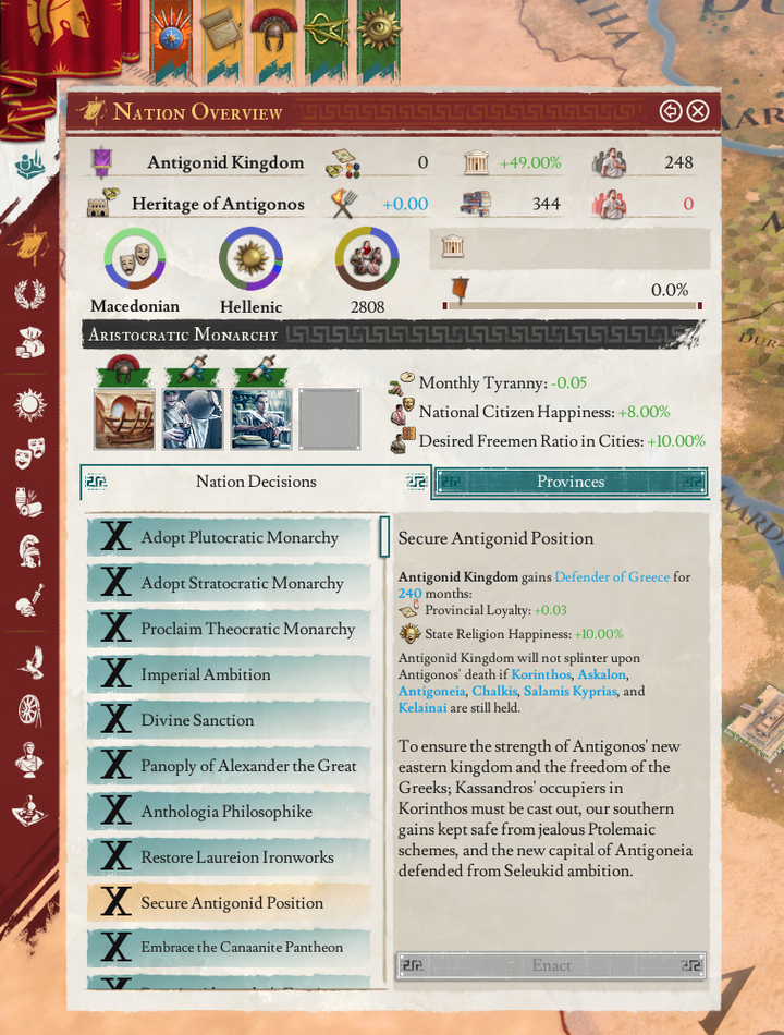
For 1.5 I decided to move Decisions into the Nation Overview. Here it is in the new UI for 2.0. Now, you select a decision to read more about and enact it with a separate button. 在1.5版本号,我打算把决议移动到国家界面内。这是2.0版本号的新用户界面。现在,你可以选择一项决议来阅读更多内容,并且可以用一个分开的按钮来执行决议。
And oh, you will be able to access Nation Overview by clicking the big Nation flag in the corner. So many of us try to do this all the time (yes, we tracked it in usability tests, and I've seen your comments about it). So I added that for the UI rework. 哦,另外,你将能通过点击角落的大国旗来进入国家界面了。我们中的很多人一直试着这么做(是的,我们追溯到了可用性测试,而且我看到了你们关于它的评论),所以我把它加入了UI 重制中。
We also gave the Outliner some love: 我们也给概览界面带来了一些关爱:
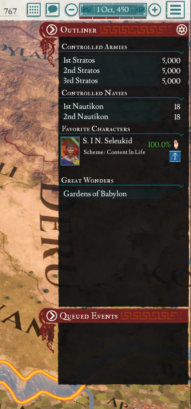
The Outliner has gotten a more compact look. It's slimmer, information is tightly packed within it to avoid too much scrolling, some added consistency for the button hiding or showing the Outliner and Queued Events. 概览界面有了更紧凑的外观,它变得更细长了。为了避免太多的翻页,信息被紧紧压缩在内,隐藏或显示详情界面与事件队列的按钮更一致了。
Next up is Character UI: 然后是人物界面:
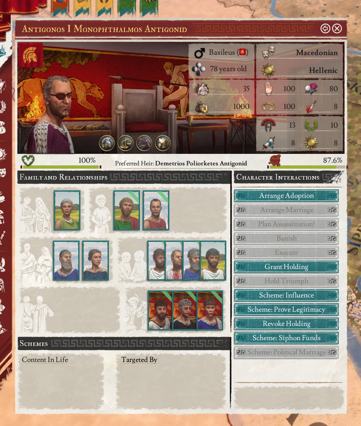 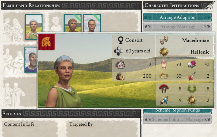
This view has gotten some of that art boost I mentioned as one of my goals for the rework. I felt that characters should have more of a personal touch to them. In fact, we have added a series of backgrounds for character portraits for this update, and in the detailed Character UI - as well as in the Nested Tooltip card - you see the full width version of that image. The backgrounds provide flavor and contextual information. Apart from terrain images based on the character's location and government related backgrounds, we also have specific images behind characters who are dead or imprisoned. 如我所说,作为我在UI重做工作中的任务之一,这个界面得到了一些美工方面的改进。我感觉人物需要更多的个性化改动。实际上,我们为了这一次更新,给人物形象加入了一系列背景。在详细的人物界面中——以及在成堆的提示框后面——你可以看到图片的完整宽度。背景提供了特点与背景信息。除了基于角色位置与政府有关背景的地形图片外,我们还在死亡或者被监禁的角色身后设计了特别图片。
That's all from me for this week. I appreciate all your feedback on last week's UI rework reveal. Not to mention improvement suggestions here and on other platforms before that. Your comments and suggestions influence my work and that's a really cool position for me to be in. With UX design, I truly believe there needs to be a back-and-forth. Thank you. 这些就是我这周的所有内容了。我感谢你们上周对于UI重做揭露的反馈,还有之前在其他平台的改进建议。你的评论与建议会影响我的工作,那对我来说是很酷的职位。我真心相信用户体验设计是需要反复钻研的。感谢你们。
/Jiroro /Jiroro敬上
……But wait! Before we wrap up completely, Arheo has something to share: ……但是等一下!在我们彻底结束之前,Arheo有东西要分享:
Hi all! In usual fashion, we can't leave a dev diary without a small teaser of something new... without telling you what it is, naturally. Thus, with no further comment, I'll leave this (WIP) window here: 大家好!按照常规套路,我们不能留给你们一篇没有新的小预告的开发日志……自然不能告诉你们是什么。因此,我无可奉告,就留这个(WIP)窗口在这:
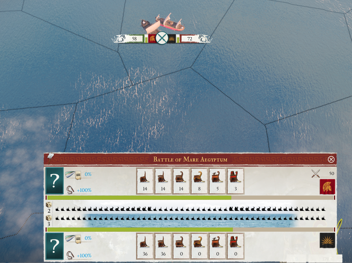
翻译:Strategemata 校对:Parapinakes 三等文官猹中堂
欢迎关注UP主和斗鱼主播小牧Phenix! 欢迎关注牧游社微信公众号和知乎专栏!微信公众号近期改版为信息流,欢迎置顶订阅不迷路,即时获得推送消息! 欢迎加入牧有汉化,致力于为玩家社群提供优质内容!组员急切募集中!
|