|
牧游社 牧有汉化翻译
Imperator DD #101 - A Most Auspicious Number Arheo, Game Director, Imperator: Rome
Salvete Omnes! 大家吼啊!
It's been a while since you heard from me or the Sthlm team, so I'm here to do a few things today. 距离上次你们听到我或者斯德哥尔摩的团队的消息已经有一阵子了,所以今天我来这里做一些微小的工作。 Firstly, there's a few points of confusion to clear up! 首先我们需要澄清几点。 The team down at Thalassic began working on Imperator early this year, onboarding and getting accustomed to the game and the codebase - their first feature (Great Wonders) was created in parallel while the Stockholm team produced the 1.5 update which is currently in your hands. This has worked very nicely, however, having two studios working on parallel tracks makes it difficult to produce the kind of interconnected material that makes Imperator unique. Over the last several months, we've begun integrating and onboarding the talented folks at Thalassic into our workflow in order to enable the production of more integrated features and content which you'll discover very shortly. 我们的Paradox Thalassic团队(译注:参见9月10日开发日志的介绍)从今年伊始开始熟悉这个游戏及其代码库。他们首先给大家带来的游戏特性——奇观Great Wonders——是与你正在玩的1.5版本号更新同步开发的。这种开发模式运作得非常好,但是两个不同的工作室同时开发相互平行的内容让我们很难保持游戏内容的内在关联性——也就是让IR脱颖而出的特质。在过去的几个月里,我们都在努力将Paradox Thalassic团队的这些才华横溢的成员们整合到我们的工作流程里,从而使最终成品能更加完整。你们很快就会看到我们努力的结果。
Our last dev diaries were intended to give Thalassic a platform to show off what they've created, without flipping back and forth between the two teams. 我们过去的几篇开发日志旨在给Paradox Thalassic团队提供一个展示他们成果的平台,这样可以避免我们在两个团队之间来回切换。 Following on from this, I'd like to clarify that the next update you will receive will contain, but not be limited to, the Vitruvius update. Working with a second studio is quite new for us, and we wanted the Great Wonders feature and update to have a unique codename; in this case, it is not tied to a specific and limited release. In this case, it will be released alongside our next major update. 接下来,我想要阐明的是,你们将玩到的下次更新将包括,但并不限于维特鲁威Vitruvius更新。与另一个工作室合作对我们来说是全新的体验,且我们希望奇观特性可以获得一个独特的代号。这样,后者就不会变成一个专门的、局限的更新。因此,奇观特性将和我们的下次重大更新一起放出。
The last point of order I have here comes with a side-note: namely, that you’ll be waiting a little longer than usual for the next content update for Imperator. 最后,我顺便说一件事:这次的内容更新你们可能要比平常多等一会。 'But WHY?' “为啥?”
Well, this was hinted at a little when the 'unprecedented' scope of the upcoming release was mentioned in the last dev diary. The scope and quantity of features coming in the next release is of such gravitas that we are changing the version number to adequately portray what this represents for Imperator. 咳,上次的开发日志我们其实稍微暗示了一下,这次更新的范围是“前所未有”的。下一个版本所包含的特性范围之广、数量之多,以至于我们都要改变版本号才能充分描述它对帝皇:罗马的意义。
As such; I can now introduce the 2.0 Marius update. 如上所述,我现在将为大家介绍——2.0版本号马略Mariu更新(译注:盖乌斯·马略曾在危难之际被突破法律选为罗马执政官,进行军事改革后带领罗马人击溃入侵的日耳曼人)。 '2.0 - is this hubris?' “2.0版本号?这太狂了吧?” Well, no. I don't think so. At this stage I can only commit to a broad overview of some of the things we intend to cover with this update, though I would urge you to make up your own minds after reading the following: 唔,其实不,我不这么认为。在现在这个阶段,我只能对这次更新准备覆盖到的范围中的一部分做一个大概的介绍,但我希望你读完接下来的内容后再下结论: My overarching directives for 2.0 are pacing, warfare, and UX. 宏观来说,2.0版本号最重要的改动在游戏节奏、战争和用户体验这三个方面。
Pacing 游戏节奏 I want to achieve a more consistent and choice-based progression to the flow of the game. As of right now, much of what the game offers you is available to you from the very beginning, and there are fewer ways to customise your playstyle than I would like. We'll be looking at overhauling the inventions system and the military traditions system in order to effect a more intuitive system of progression that allows for a sense of advancement and identity to develop over the course of a game. 我希望能实现更加稳定以及选择导向的游戏体验。就现在而言,基本上所有的游戏内容在开局时就都已经提供给你了,更加独特化的游戏流程路线也比我希望中的要少很多。我们正在大改发明系统和军事传统系统。我们希望这些改变能带来一个更符合直觉的游戏进程,增加游戏中的成就感与沉浸感。 This doesn't solely mean gating existing mechanics, however, this will also tie strongly to new features and additions coming in 2.0. 但这不仅仅是调整现有的游戏机制。这还将与2.0版本号的其他新的游戏内容紧密相关。
Warfare 战争
This is a pretty big one. I've never been happy with the military recruitment and army mechanics being almost entirely divorced from historical reality and being largely set apart from the many other systems in our game. Our main military focus for 2.0 will be on tying the recruitment system(s!) into the rest of our simulation, as well as adding a much larger recognition for the cultural diversity of military forces in different parts of the map. 这是一项相当庞大的改动。目前游戏中严重背离史实且与其他系统脱节的军队招募与军事机制让我十分恼火。2.0版本号中,我们在军事方面内容的重心就是要将征募系统与其他游戏系统(们)捆绑起来,以及在游戏中展现更多不同地区的军事文化差异。 Several astute forum users have noticed that we're going to be removing the Raise Levies unit ability. I'll leave you to ponder over how that might be related. 许多敏锐的论坛用户已经发现我们准备移除动员征召兵Raise Levies的部队能力。我会把这部分留给你们,让你们自己猜猜这代表着什么。
There are of course many additional improvements coming to the warfare aspect of the game, from forts and sieges, to wargoals and cohorts. 当然,关于游戏战争内容的更新还包括了很多其他改进,从要塞与围城,到战争目标和步兵大队都有囊括在内。
UX 用户体验
Aaand then there's this. This is something we've been keeping under wraps for a while now, and which has been the sole focus of @jiroro, our UX designer, since she joined the team. 然然然后就是这个了。我们已经隐瞒了这事一段时间。自从我们的用户体验设计师@jiroro加入团队以来,这一直是她唯一的关注所在。
Many of you have expressed a desire for work on the UI, and this is something we've heard. 你们中的许多人都表示希望在用户界面上有所改动,而我们也已经听到了这些建议。
In the Marius update, we’ll be focusing on greatly improving the user experience on an interface level, as well as including a completely new art style. Since it'll be entirely impossible to avoid showing any features off without teasing at the UI rework, here are some in-progress shots of the state of things on our highly experimental branches. 在马略Mariu更新中,我们将着重于在交互界面上极大改善用户体验,同时采用全新的艺术风格。由于我们不可能在不泄露用户界面的情况下展示任何游戏特性,所以以下我们将给出些高度试验性而且仍然还处于改动中的内容的截图。
The bright visual identity of Imperator was tied to too many periphery elements (branding, key art) to change at this stage; it's something we intend to work with and refine going forwards - we'll be preserving this lighter style, in contrast to some our sister titles such as Crusader Kings, which opted for a darker approach. I wanted a bold style, dropping a lot of the unnecessary cornels and border decorations that took up a significant quantity of screen real estate. You'll notice we still have decoration; this is used more carefully, and serves a purpose of its own - to draw attention or indicate the relative importance of an interface, or to create a feeling of immersion with pictures and scenes. 目前,IR明亮的视觉特性与太多外围元素(铭牌、按键艺术等)关联在一起,以至于无法更改,而这是我们在未来打算努力并改进的——与其他姊妹游戏(如十字军之王CK)采用更暗的方式不同,我们将保留这种明亮的风格。我想要一种大胆的风格,舍弃许多不必要的、占用了大量屏幕空间的山茱萸和边框装饰。你会注意到我们仍然保留了部分装饰。对这些装饰的使用会更为小心,并有其自己本身的作用——引起玩家注意、表明界面的相对重要性、或是给图片和场景营造一种沉浸感。
A significant directive I've pressed home, is to bring out the importance of characters; no more beige backgrounds, more breathing room, additional usability functions (character search, anyone?), and a suite of backgrounds intended to give characters a little more life. 一项我已经强调过的重要指引是要彰显人物的重要性。我们不再采用米色的背景,而是加入更多的活动空间,额外的实用功能(人物搜索,有人想要吗?),以及一套旨在使人物更加鲜活的背景。
Part of the behind-the-scenes advantages of this overhaul is also to support easier modding, color switching, and the potential for culturally thematic UI themes (though with the scope of 2.0, it should be said that we will not be adding any of this in the immediate future). 这次大修所带来的看不见的好处还包括支持更简单的模组制作、颜色切换、以及潜在的特定文化主题的用户界面(尽管这些在2.0版本号的范围内,但我们在未来一段时间内不会添加上述的任何一项特性)。
It is incredibly important that you are aware that the art and UX overhaul is not complete, and even things which look overhauled or reskinned may well not yet be finished. 非常重要的一点是,请记住美工和用户体验的大改还没有完成,甚至一些看起来已经重做或换了皮肤的东西可能也还没有完成。
Nb: All screenshots are provided at our minimum supported resolution of 1920x1080. 注:所有截屏都是以我们支持的最低分辨率1920x1080展示的。
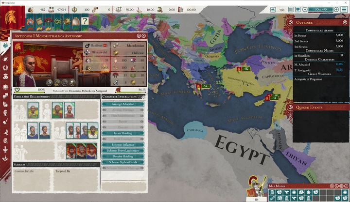
The WIP Character Window. This is one of our larger standard windows in the new UI - we wanted to give characters a great deal more space and personality by doing away with the beige backgrounds, and inserting a more immersive background selection system. Here you can also see that the top bar has been moved to the side, to accommodate more usable screen real estate. 仍在改动中的人物窗口。这是我们新的用户界面中较大的标准窗口之一——我们希望通过消除米色背景并插入一个更具沉浸感的背景选择系统,以此来为人物提供更多的空间和个性。你还可以看到顶部栏已经被移到侧面以提供更多可用的屏幕空间。
Future plans, inspired by some of the popular user mods (such as the Better UI mod by Agamidae) are to include balance indicators on top bar resources, as well as showing additional contextual information in the top bar. 受到某些广受欢迎的用户模组(例如Agamidae 的Better UI模组)的启发,未来我们计划在顶部栏中显示资源平衡指示器和一些额外的文本信息。
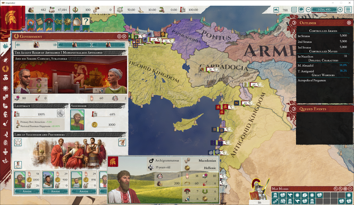
While function definitely takes precedence over form, it became apparent that we had much more space to work with in our newer style; including larger set pieces adds a lot to the feeling of immersion when using the UI. The astute amongst you will notice that we have a new tooltip system - the recent release of CK3 has enabled us to make use of much more intuitive nested tooltip technology. 虽然功能绝对优先于形式,但在我们的新风格显然还有很多的改进空间。使用大摆件能极大增加用户界面的沉浸感。精明的你会注意到,我们有一个新的提示框系统——最近CK3的发布使我们能够使用更加直观的嵌套提示框技术。
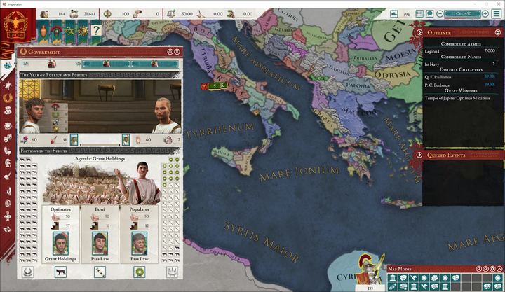
I couldn't resist the opportunity to make the senate feel more alive. 我无法拒绝使元老院更有精神的机会。
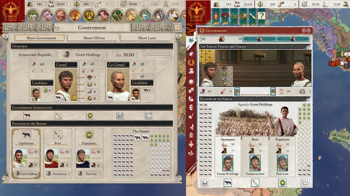
As you can see, we're working a lot to reduce the size and visual clutter of game interfaces. 正如你所看到的,我们正努力减少游戏界面的尺寸和视觉混乱。
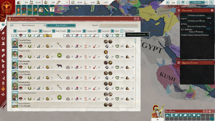
Of course, this is not possible everywhere; the distinction between windows you're likely to need while using the map, and otherwise, has been accentuated. You may also notice a few additional tidbits here ;) 当然,所有地方都做到这一点是不可能的;相反,当你使用地图时,你可能会用到的不同窗口之间的差异被放大了。在这里你可能还会注意到其他一些彩蛋(笑)。
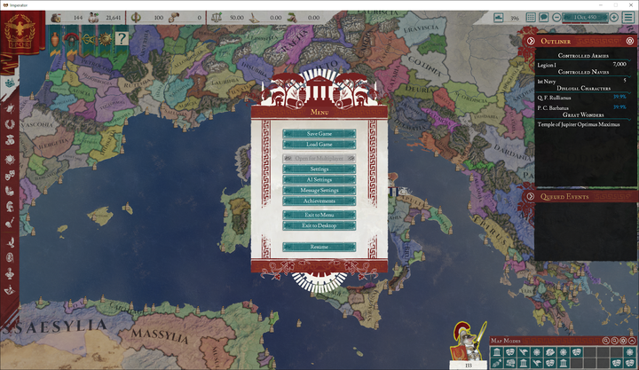
Even the in-game menu has received some attention. 甚至游戏中的菜单也有受到关注。
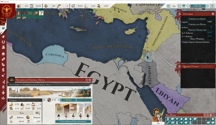
Widely regarded as one of our most confusing windows, we've done a lot of work on the Territory window to add some breathing room to information. 很多人都认为领地窗口是我们现实得最混乱的窗口之一,我们在这一窗口上做了许多工作,为信息之间增加了些喘息的余地(译注:也就是信息之间差异性提高了)。
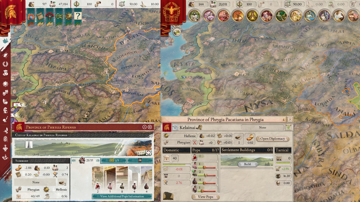
There is, of course, much more to show here. Next week @jiroro will take a long dive into the reasoning and specifics behind the UI rework. 当然,我们还有许多内容要展示。下周@jiroro将会深入探讨用户界面重做背后的原因和细节。
As always, I look forward to hearing your comments. 与往常一样,我期待着看到你们的评论。
翻译:亚历山德罗夫 twhhome 校对:Parapinakes 斯普特尼克
欢迎关注UP主和斗鱼主播小牧Phenix! 欢迎关注牧游社微信公众号和知乎专栏!微信公众号近期改版为信息流,欢迎置顶订阅不迷路,即时获得推送消息! 欢迎加入牧有汉化,致力于为玩家社群提供优质内容!组员急切募集中!
|