|
牧游社 牧有汉化翻译
Imperator: Rome - Development Diary - 16th of September 2019 Visual changes to 1.2 (and earlier) Carlberg, Lead Pixel Farmer on Imperator
Hello and welcome to today development diary for Imperator: Rome! 大家吼!欢迎来到今天帝皇:罗马的开发日志!
I'm Carlberg, the Art Lead on Imperator, and today we're going to have a look at some of the visual changes that we've done to 1.2 Cicero. It's also going to be a bit of a retrospective at some of the visual additions since release as well, and our thoughts behind them. 我是Carlberg,也是帝皇:罗马的美术总监,今天我们要来看看一些我们给1.2版本号西塞罗Cicero更新打造的一些视觉变化。与此同时我们也将回顾一些游戏自发布以来的视觉改动,还有这些改变背后的想法。
New Interfaces and UX 全新的界面和用户交互
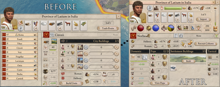
As shown in earlier DD's we've been working on improving our interfaces. This is a collaborative effort between our 2D artists and UX designer to make sure each window becomes more easily readable and contain the information you might need at a glance. In the case of our province view for example some information that wasn't as necessary was moved out, and more important information moved in from other interfaces to make sure it's closer at hand. 正如之前的开发日志所展示的,我们一直在努力改进游戏界面。我们的2D美工和UX设计师携手努力,以确保每个窗口的阅读体验更容易,并让玩家能一目了然有所需要的信息。就拿我们的省份视图来说,我们移除了一些没什么用的信息,而更重要的信息从其它界面移了过来,以此确保能更轻易获取重要信息。

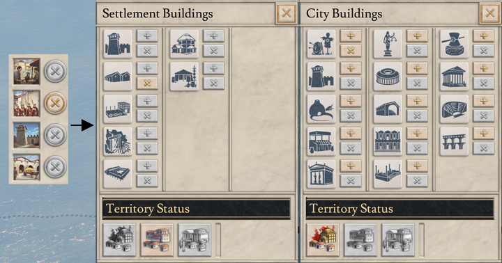
The new building icons were another area where we sought to increase the clarity, as the previous icons were small and unclear. When we added the new set of buildings we made sure that they and the old ones had a more iconic look and easier silhouette to read. This includes both the new set of buildings for settlements and for cities/metropolises. 而新的建筑图标也是我们想提高清晰度的另一个方面,因为之前的建筑图标不但很小,而且不怎么清楚。当我们添加新的各类建筑时,我们设法确保它们和旧建筑相比拥有更加标志性的外观以及更容易辨别的剪影。这包括用于聚落的新建筑和城市/都会的新建筑。

In general we're looking at making our interfaces more clear and streamlined. It's a bit of a balance we need to strike between having information readily available, but it shouldn't be so cluttered that it's hard to actually discern. This is of course an ongoing process and will continue past 1.2 Cicero. 总的来说,我们正在着手于让我们的界面更加清晰和流畅。不过我们需要在各种信息之间取得一种平衡;我们希望能有更多信息随手可得,但是又不希望它太杂乱无章,让人无法辨别。当然,这是一个还在进行的过程,并且在1.2版本号西塞罗更新之后也会继续。
Curtailed Fog 减少迷雾
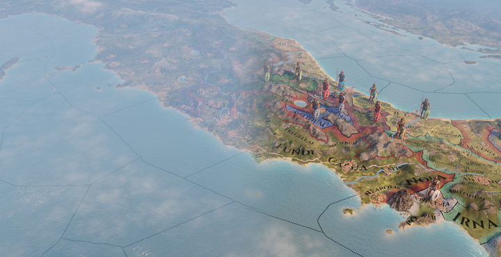
As we got to hear from a lot of people after release, the fog was too strong. So much so that a mod popped up that went in and removed it completely. We definitely agreed it was too much and dialed it back. The before and after images below will give you a good idea of the change to bring more clarity to the world. 正如游戏发布之后我们从许多玩家那里听到的那样,迷雾太浓了。甚至很快就出来了一个方便玩家把迷雾完全移除的Mod。我们一致认为这个雾做得太过分了,所以把这个设计打了回去。下面这些前后对比的图片会让你对迷雾的变动能让世界变得多清晰有一个很好的了解。

The fog became a problem when the game camera was at certain angles and just overall. We made sure that it'd look better at all zoom levels and just play a role in the background, for areas much further away in the distance. 迷雾在游戏视角处于特定角度或干脆正常看的时候都会成为一个问题。因此我们现在让迷雾在任何缩放倍数下都能观感更好,并让迷雾只扮演背景的一部分用在较远的地区。
Progressing civilization 进步中的文明
In 1.2 we dialed back the amount of visual cities in the world to create a more stark contrast between sparsely settled provinces and large bustling cities. This also makes the growth of cities and civilization stand out more in the world. 1.2版本号更新中,我们减少了世界地图上可见城市的数量,在人烟稀少的省份和繁华的大城市间制造了鲜明的对比。这也让城市和文明的发展在世界上更加突出。

A living world 一个活生生的世界
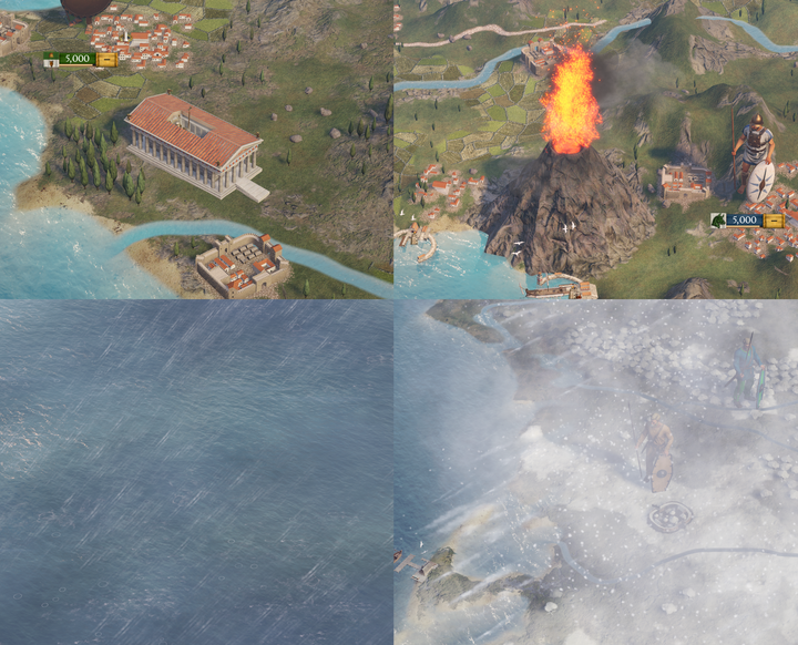
Starting in 1.1 we've been adding more of what we call dynamic objects to the world. These come in the form of constructible wonders, storms, volcanic eruptions and the like. They are ways for us to show the progress of the classical states, as well as the uncaring nature of the elements and the world itself. 从1.1版本号开始,我们向这个世界陆续添加了更多的动态物件。它们以可建造的奇观、风暴、火山爆发等形式出现。它们是我们展示古典国家进步的方式,也体现了这些元素和世界本身无情的本质。

We aim to add more dynamic aspects to the world in the future, and it should also open up the avenue for our modders to add interesting things to the world as well. 我们的目标是在未来为这个世界增加更多的动态物件,与此同时也为我们的Modder开辟道路,让他们能加进去更多有趣的东西。
Seagulls 海鸥
So as some may have spotted, and we have noted earlier, is that now all the ports in the game have seagulls flying overhead. This is not merely for aesthetics but also a sign that the territory is a potential port location. 正如之前有人注意到的,现在所有游戏里的港口都会有海鸥飞过,而这点我们以前也提到过。这不仅仅是为了美观,还能作为一个标志,表明该地区是个潜在的港口位置。
Deepwater ports were hard to construct in this era, the Romans did, but more so during the Imperial era. Most states instead had to rely on using naturally occurring deepwater for their ports. So now, even if a territory is uncolonized, these seagulls will be flying overhead as a telltale sign of the natural harbor location. 在这个时代,要建造深水港非常困难,虽然罗马人做到过,但他们也是要到帝国时代才建得比较多。大多数国家需要依赖天然形成的深水港。所以现在,就算一个地区还没有被殖民,作为天然港口位置的标志,还是会有这些海鸥从上空掠过。

Visualizing the Future 展望未来
Going forward we aim to add more interesting aspects to the world to tell the state of your empires, or what might afflict them. A more living world we will all enjoy conquering. 未来我们打算增加更多有趣的东西,能告诉你自己帝国的状况,或者说什么东西可能影响它。我们希望能给大家带来一个更加鲜活的世界,一个让大家能更加享受去征服的世界。
Some of the things on the horizon I'm burning to show you, but those will have to wait until they're ready for showing. 我很想向大家展示某个近在眼前的内容,但是我们必须得等到它们准备好展示了再说。
That's it for this weeks Dev Diary! 这就是这周开发日志的全部内容了!
|